
I use Google Analytics on this blog to track visits and have collected statistics for couple years now. I toyed with these a bit today to see where are the visitors from, just out of curiosity and for no particular other reason. I used Tableau to generate the below stats, it connects to Google Analytics directly and has a free trial version.
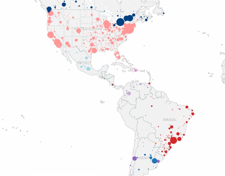
Here is accumulated visits map by city/country: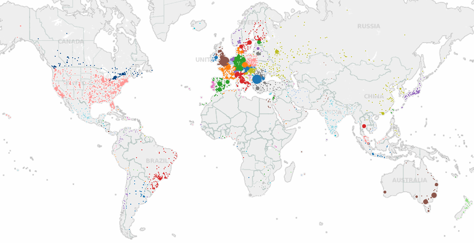
The size of the circles is proportional to the number of visits from that city, I get a lot of visits from the major cities in Europe, so hence the larger dots there. The visits from the USA are much more spread, i.e. coming from many different cities. A treemap of the number of visits by country shows the USA as the top of the list, followed by the UK and Germany, France, the Netherlands:
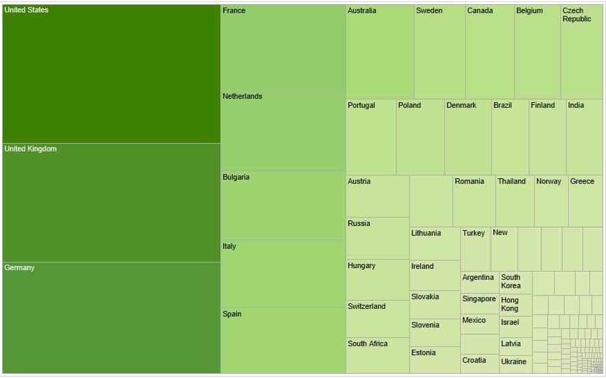
That’s interesting, but probably not surprising, as the top countries are also large in population. Probably 95% of the visits from country #6 – Bulgaria are mine, so I will filter these out for the next charts 🙂 .
Next, I decided to factor in the country’s population and compare that against the number of visits from that country to get something more comparable. I created a calculation that would provide a [# of visits/country’s population] ratio and re-generated the treemap:
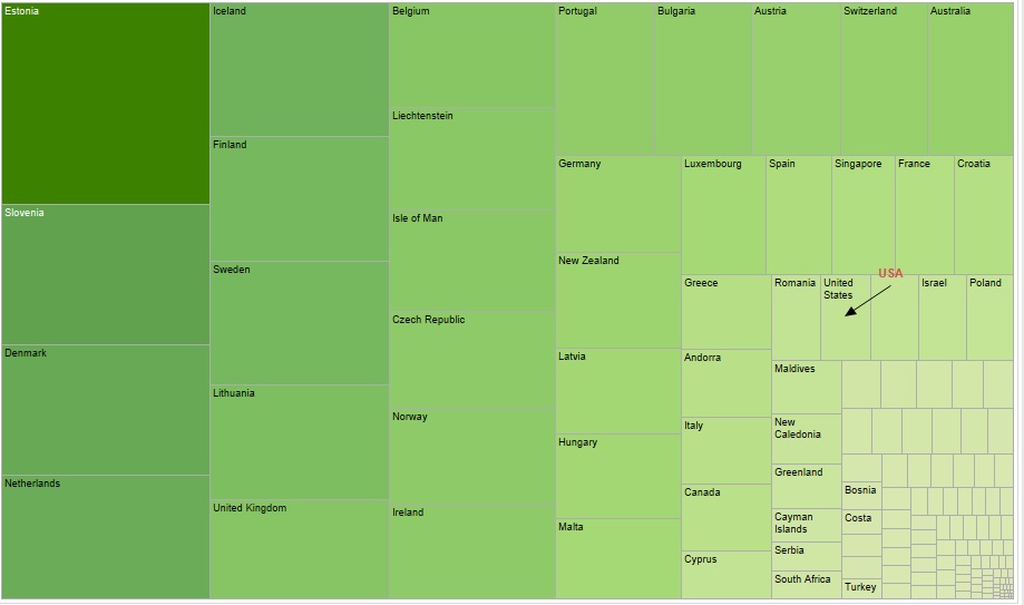
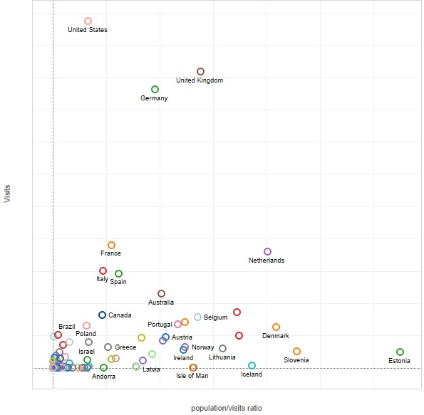
So that’s more interesting, my projects seem to be interesting to large % of the population in Estonia, Slovenia, Denmark, the Netherlands and so forth. Estonia seems to lead by a factor, I wonder why that is. Greetings to you guys from Estonia 🙂 .The USA that was ranking top is now way behind.
Few more charts by region, the Americas show the distinct concentration of visits from the North-East of the USA and then the East coast, Brazil also generates traffic:
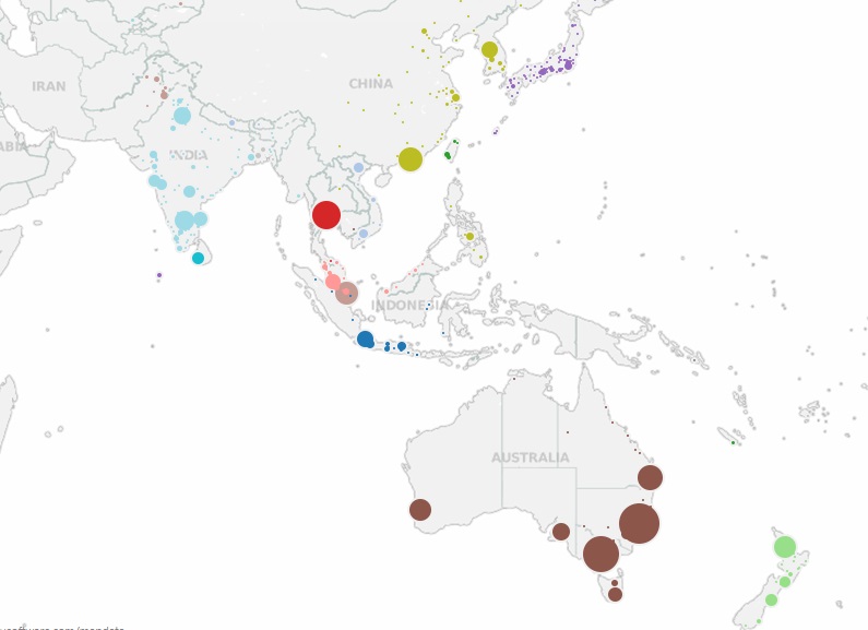
The Asia-Pacific region shows concentrated visits from Australia’s largest cities on the East, visits from Japan are very spread, coming from many places:
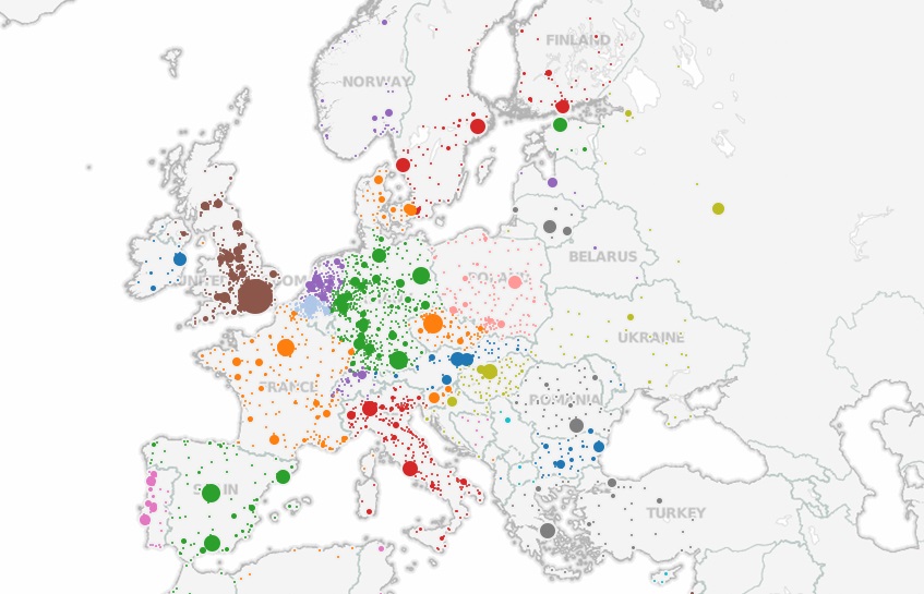
Visits from Europe are predominantly from the North-West, I see a large % of visits originating from the city of London. The Netherlands, Belgium and the western regions of Germany also generate significant % of traffic. The Netherlands and Belgium stand out because traffic isn’t concentrated only in the large cities (like Spain and France), but very evenly distributed all over the territories:
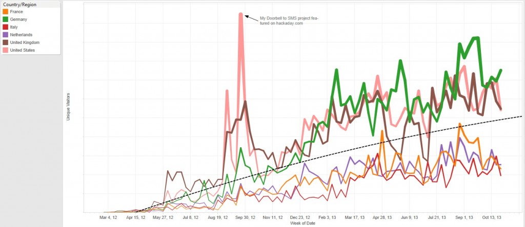
Visits over time, these are filtered by the top countries only, metrics are hidden to preserve some level of privacy:
Looking at the top pages visited, it is clear that my Raspberry Pi related projects enjoy most interest:
Interesting stats, enjoyed putting these together too.
Interesting stats! Thanks for pointing out Tableau, looks very interesting.
Greetings from Greece!
Hey Martin. Nice insight in the world-wide attention your work receives!
I’m using Tableau @ work. A great tool for large scale analysis.
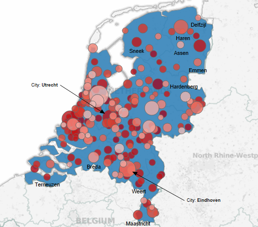
Could you provide an overview of the Netherlands? I think the Utrecht & Eindhoven area are one of the larger dots 😉
Hi, here is how it looks:
I leave reading the visualization/analysis to you 🙂
Thanx!
It seems you get visitors from all over Holland!
Thats amazing! I notice a blank void over Wales in the UK where Glyn and I are based, but when I look up my ip location it seems to be london which is a good 200 miles away.. so maybe some of that london dot is us 🙂
It depends on how Google Analytics is getting your location. I have no idea how that one works. Many just use your ISP’s home location!.
If you look at http://www.iplocation.net/, you see some different ‘tools’ that determine your location.
In my case, the first three ALWAYS give some location 50-150km away from where I am. The last one (GeoIP from MaxMind) is sometimes spot on – the right city at least – and sometimes even more away from where I am than the other three…
I too ran a IP check for Trystan’s IP and it reported it is located in London. So mystery solved, seems that some UK ISPs mask the actual location..
Saludos desde Cali-Colombia. Nice blog.