I log the AC mains voltage at my house starting July 2013, you may recall my post where I was concerned about the unusually high voltage readings at home. Now that I have few months of data collected, it is time to do some analysis. I have 405835 measurements in total since then, taken every 10 seconds. I am logging these to emoncms, then exported as CSV and used Tableau Public to generate the below analysis.
Voltage (and frequency) varies with the load of the grid, lower voltage indicates higher consumption in the segment where I am connected and higher voltage means the opposite, i.e. grid is experiencing relatively low load.
I started with an analysis of voltage by day of the the week and then colored by the quarter of the year, Q4 is when the heating season starts so there is obviously a difference. Wednesdays in Q3 Thursdays in Q4 are the outliers here, I wonder why. Weekends on the other side seem relatively unaffected by the season, probably this has to do with commercial usage.
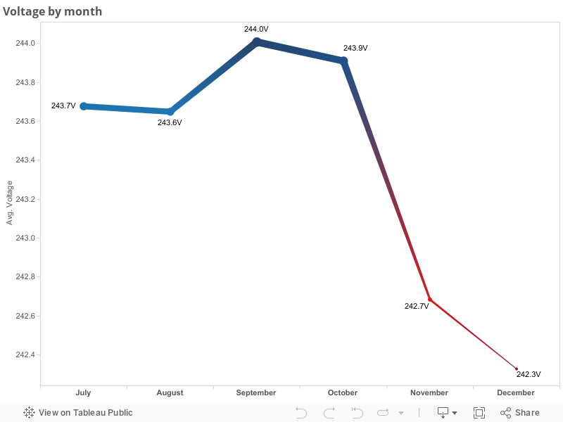
My next analysis is voltage by month, the hot summer months when air conditioning is used a lot is probably the reason for slightly lower voltages in July and Aug:
Great visualisations Martin. Simplifing a little, the observations will be a combination of how the high voltage distribution network is managed (usually to better limits than these show) and the local low voltage network sharing the same distribution transformer.
There is a hint here of running close to capacity on the local network.
The outlier > 250v bucket on the histogram is probably outside the regulatory requirements for the utility (assuming less than one half cycle spikes are filtered out). You can complain – overvoltage is not kind to many appliances, especially old style incandescent lights. If the utility reacts simply by dropping down one tapping on the local distribution transformer, the absolute values will move down, but risks leaving the supply a little low at peak consumption time.
It would be interesting to overlay sunset/sunrise times on the month/hour heat map – there is perhaps a correlation in the bottom left quadrant.
Where I live, complaining to the utility company is like talking to a brick wall plus I’m happy that it isn’t the other way around i.e. generally low voltage.
I too believe the length of day has impact (you can see it in the last heatmap), even thought of analyzing if daylight saving time switching has any measurable effect using this data. Will see if I can find some time to get this sort of analysis done.
martynj
There is way to split out the local distribution effect from the management of the grid that feeds it. Heavy demands on the grid cause voltage droop, but also the 50/60Hz slips below target (logical since the huge rotating machinery loses inertia until the motive power input is increased). Overloads on the local network will not do this (unless correlated with many other local networks doing the same).
So sniffing the Hz (surprisingly hard to do well) can provide clues also. In fact, there is an old scheme where dropping the Hz to a certain threshold triggered some industrial tariffs to temporarily reduce their loading – its cheaper for the Utility to reduce prices a little than start up expensive ‘peak-lopping’ generators.
One proposal embedded in the European initiative for ‘Smart Metering’ was the creation of virtual power generators for exactly this need of peak lopping. The idea was to signal consumers in real-time to shed load (with some financial incentive to say yes). Then thousands of consumers dropping a couple of kilowatts each becomes the equivalent of starting up, in a very short time, x MW of ‘extra’ capacity.
Last time I looked, this proposal was stuck since the Utilities wanted to turn it into ‘Shed Now – no reward’. Hmm…

Great visualisations Martin. Simplifing a little, the observations will be a combination of how the high voltage distribution network is managed (usually to better limits than these show) and the local low voltage network sharing the same distribution transformer.
There is a hint here of running close to capacity on the local network.
The outlier > 250v bucket on the histogram is probably outside the regulatory requirements for the utility (assuming less than one half cycle spikes are filtered out). You can complain – overvoltage is not kind to many appliances, especially old style incandescent lights. If the utility reacts simply by dropping down one tapping on the local distribution transformer, the absolute values will move down, but risks leaving the supply a little low at peak consumption time.
It would be interesting to overlay sunset/sunrise times on the month/hour heat map – there is perhaps a correlation in the bottom left quadrant.
Great comments, thank you.
Where I live, complaining to the utility company is like talking to a brick wall plus I’m happy that it isn’t the other way around i.e. generally low voltage.
I too believe the length of day has impact (you can see it in the last heatmap), even thought of analyzing if daylight saving time switching has any measurable effect using this data. Will see if I can find some time to get this sort of analysis done.
There is way to split out the local distribution effect from the management of the grid that feeds it. Heavy demands on the grid cause voltage droop, but also the 50/60Hz slips below target (logical since the huge rotating machinery loses inertia until the motive power input is increased). Overloads on the local network will not do this (unless correlated with many other local networks doing the same).
So sniffing the Hz (surprisingly hard to do well) can provide clues also. In fact, there is an old scheme where dropping the Hz to a certain threshold triggered some industrial tariffs to temporarily reduce their loading – its cheaper for the Utility to reduce prices a little than start up expensive ‘peak-lopping’ generators.
One proposal embedded in the European initiative for ‘Smart Metering’ was the creation of virtual power generators for exactly this need of peak lopping. The idea was to signal consumers in real-time to shed load (with some financial incentive to say yes). Then thousands of consumers dropping a couple of kilowatts each becomes the equivalent of starting up, in a very short time, x MW of ‘extra’ capacity.
Last time I looked, this proposal was stuck since the Utilities wanted to turn it into ‘Shed Now – no reward’. Hmm…